

Creating Accessible Social Media and Web Content
With over 253 million people who are blind or have low vision around the world, creating accessible content for this audience is essential for brands across all industries. If your web and social media content isn’t accessible, you are missing out on a huge opportunity to reach and connect with valuable consumers. 2.4% of US citizens have a vision impairment, which means that if you get 10,000 visitors a month, 240 of them will not be able to consume your content.
Optimising your web accessibility just takes a few simple steps and can have positive effects on your Search Engine Optimisation (SEO) and discoverability, and improve your website’s overall user experience.
Alternative text and image optimisation
Alternative text, or alt text, is a great way to make images and web pages more accessible for people who are blind or have low vision. It is easy to implement, involves minimal time commitment and makes it easier for users to engage with your content in a meaningful way. It can also increase your search ranking in Google Images.
Alt text ‘Do’s and Don’ts’
Do use alt text to describe important images that add value to your content.
Do describe the main visual elements of the image.
Do acknowledge the image context, including its purpose and its position on the webpage. The same image may be described in different ways, drawing attention to different elements, depending on the context of the page.
Do include a description of text-based images
Do use alt text to describe the link destination on buttons and links to other webpages
Don’t include alt text if the image or icon is decorative; for these images the alt text field should be left empty.
Don’t start your alt text description with “image includes…”
Video content
Similarly to images, video content isn’t automatically optimised for blind and low vision users. To make videos more accessible, add a voiceover describing the actions taking place in the video. Adding closed captions is essential to make videos more accessible for users who have low hearing.
Contrast
Using high contrast between backgrounds and text in your branding and web content is another easy way to make your content accessible and maximise engagement. Different contrast ratios are appropriate depending on whether you’re displaying large text, small text or icons.
Try using a contrast calculator to see how accessible your branding colours are.
Contrast ratio guidelines
For large text, such as a heading or text-based image, the minimum contrast ratio is 4.5 to 1.
For smaller text, the contrast should be higher, with a ratio of at least 7 to 1.
For icons or graphics, the contrast can be lower, but should be at least a ratio of 3 to 1.
Ideally, text should have a AAA rating against WCAG guidelines. If in doubt, aim for a contrast ratio of more than 10 to 1. WebAim contrast checker provides a ‘pass’ or ‘fail’ check on your chosen colours, and provides examples of each element.

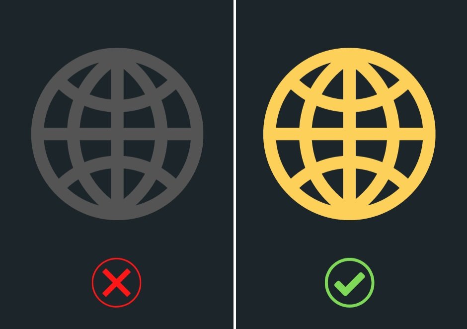
It’s also important to remember that graphs should use highly contrasted colours, shades and textures to distinguish between different parts of the graph. Check out the example below to see how contrast improves accessibility, as well as making your content more engaging!
Screen reader optimisation
A well-structured page is easier to navigate for all users, but is especially important for screen-reader accessibility. Being mindful about creating descriptive, meaningful links will also optimise your content to maximise engagement from your blind and low vision audience.
Web content structure
Without a defined structure, your web content may end up reading as one very long paragraph for blind or low vision users. So how do you make your web-page more accessible?
Use headings - this will help screen-readers navigate the page and allow users to find the content they’re interested in
Ensure your text is in short paragraphs so it is easier to digest the information
Make sure that all text formatting is able to adapt to to fit the screen when magnifying the page to view text and images more clearly
Aim to use text instead of text-based images where possible
Meaningful Links
Make sure any internal or external links to other webpages are descriptive and meaningful. A screen reader will read the text on the link button, so ambiguous text buttons reading ‘click here’ don’t offer any information about the link’s destination. Try and use text describing where the link will lead, such as ‘join the waitlist’ or ‘book flights’.
Using colours to signify what a link means can also be helpful. For example, on a form, colouring the ‘submit’ button green, as opposed to a red ‘cancel’ button, can help users identify the significance of the links.
You can also use audio status messages on destination pages to help users know where they are in the link function process. These can announce to users that they have a certain amount of time left before their login expires, when their search returns results or when a page has loaded.
Social Media Content
As well as using alt text for images on social media, it’s important to use accessible fonts and optimise your hashtags. Cursive fonts can be difficult to read, therefore block letter fonts are necessary to use.
Some easily readable fonts include:
Arial
Times New Roman
Calibri
Tahoma
Helvetica
Verdana
To maximise your hashtag reach and effectiveness, make sure that you use Camel Case, which means you capitalise each word within the hashtag. That makes sure it will be read as intended, rather than words blending together. For example, instead of #accessibletourism use #AccessibleTourism.
It is also important to recognise that emojis interrupt your caption text. If you plan to use emojis, they should be used at the end of the sentence and only used only when necessary. They should not be used to replace words, or be unnecessarily repeated. For example, if you used the hand over mouth emoji three times at the end of your sentence, it would read “Face with Open Eyes and Hand Over Mouth emoji, Face with Open Eyes and Hand Over Mouth emoji, Face with Open Eyes and Hand Over Mouth emoji”. It is not an enjoyable experience.
Click here to hear what screen readers read with bad formatting.
More tips
We’ve included our top tips for easy ways to maximise accessibility of your web content for people who are blind or have low vision, and optimise your user experience and SEO in the process. This list isn’t exhaustive - there are plenty of other things to consider when creating accessible web content! Check out the WCAG 2.1 Guidelines for a more detailed list of features to make your content accessible.